How to find the worst 16% of your portfolio (before the rules make you).
- Energy
- Legislation
- Real estate
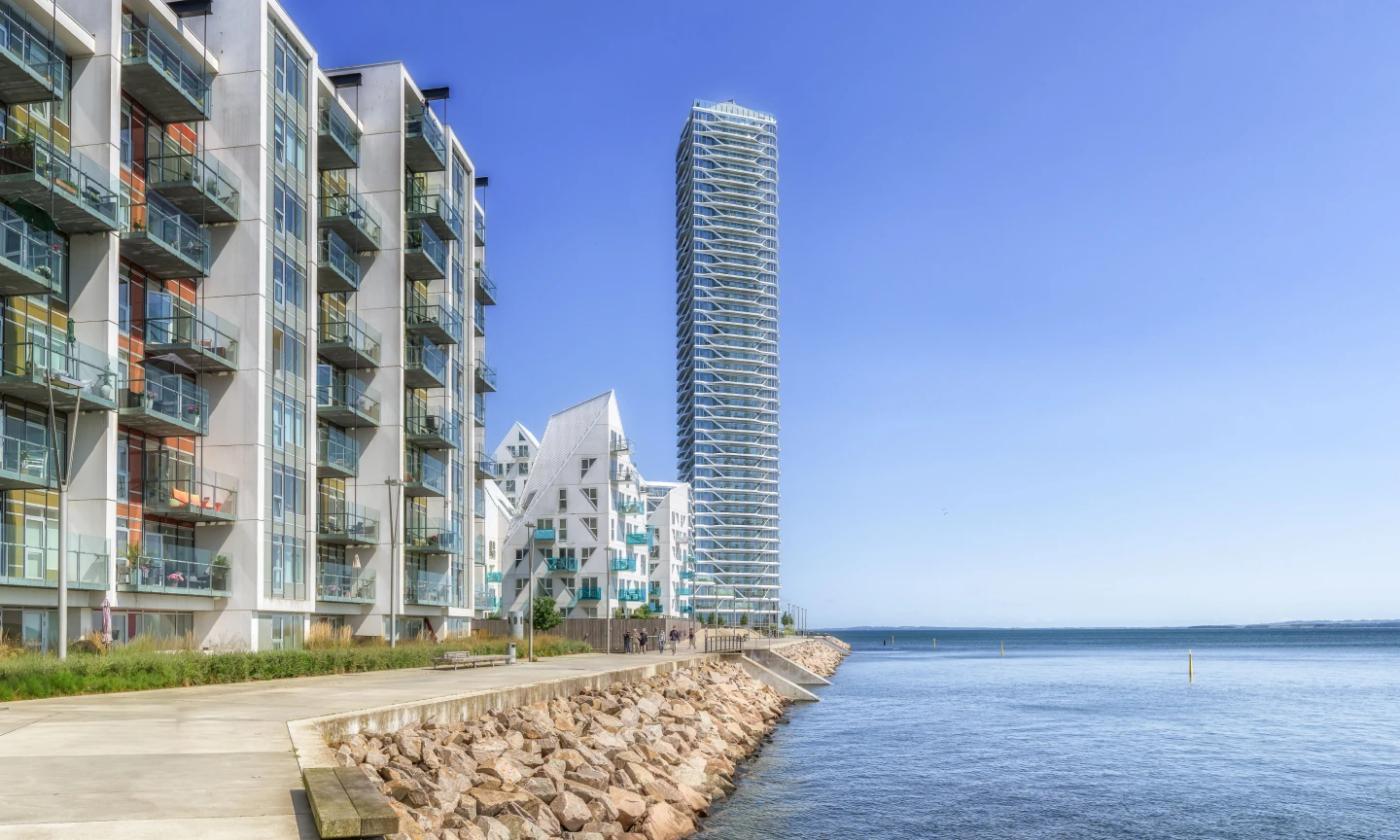
Denmark's draft bill already contains the number. It just isn't law yet (at time of publishing, anyway. We'll be sure to update as soon as it is).
The consultation version proposes a threshold of 190 kilowatt-hours per square metre per year for non-residential buildings by 2030, tightening to 168 by 2033. Buildings above the line have to be under it by then. The figures can still move but at least now you’ve got a rough idea of where it will sit.
It also means that you can, today, work out which of your buildings are close to the line. Here's how, in four steps – and why now is considerably cheaper than later.
What the rule actually is
Under the recast EPBD (Energy Performance of Buildings Directive), member states have to set minimum energy performance standards for non-residential buildings, e.g. offices, retail, logistics.
Each member state characterises its non-residential stock as it stood on 1 January 2020, ranks those buildings by energy use, and draws a line.
The energy use of the next building after the worst-performing 16% becomes the threshold to be met by 2030.
A tighter line covers 26% by 2033, with further thresholds for 2040 and 2050. So the standard gets tighter over time.
The default is that those thresholds are expressed in kWh per square metre per year – final or primary energy use. But member states may instead set thresholds that correspond to an energy performance class, and the Commission's guidance explicitly allows it, on the grounds that it makes the scheme easier to communicate and monitor, which is fair enough.
Denmark's draft bill does both. It sets a kWh figure – a proposed 190 kWh/m² per year to be met by 2030, tightening to 168 by 2033 – and then explains where those numbers sit on the existing label scale: the 2030 line falls between E and D, the 2033 line between D and C.
One thing worth paying attention to before you jump in is that whatever form the threshold takes, it has to capture the worst-performing 16% of the stock by energy use. The instrument doing the capturing is a calculation, and it can only do that job as well as the assumptions underneath it.
Two other things follow.
The 16% is fixed to 2020, not to now. It's a characterisation of the national stock at a point in the past. Improving your building doesn't move the line, and neither does anyone else's.
You can already test yourself against it. There's a draft figure to measure against, and even if it moves, it won't move by an order of magnitude. For most buildings it's a yes-or-no question against 190, and you can answer it this month rather than next year. Buildings with unusual energy needs get a higher line – see step two.
The four steps
Step one: Find the number that actually decides it
One figure decides whether a building sits inside the worst 16% or outside it: its calculated primary energy, in kWh per square metre per year. Not what the meters record. Not the letter on the front of the certificate. The calculated figure underneath it.
Getting hold of it is harder than it should be, because it isn't printed on the report you were sent. The certificate is really a data file – an XML – and the PDF sitting in your files is a summary generated from it. So asking for the EPCs will likely just produce a stack of documents that don't contain the one number you need. Ask for the XML instead.
There's also no shortcut for a portfolio. The figure is calculated building by building, and a property is the highest level it exists at – there's nothing to look up for a portfolio as a whole. Today, a property with several buildings may carry both a property-level figure and one per building. The new rules require each building to be labelled individually, so the property-level figure goes away and the building becomes the only unit that counts.
Which makes this step real work rather than a formality. Until you have the figure for every building, you don't have a compliance position – you have a set of letters, and the letters aren't what the threshold is applied to.
Step two: Work out which line applies to you
For most buildings, the 2030 line is 190 kWh/m² per year, tightening to 168 by 2033. But it’s not for everyone.
The draft adds a supplement for buildings with special energy needs – long operating hours, high lighting levels, extra ventilation, heavy hot-water use, or unusual room height. It’s calculated the same way as the existing energy budget allowance – the energiramme – in the Danish building regulation. If you run logistics, retail, or anything operating well beyond office hours, your threshold is higher than 190, and possibly by a lot.
Get this wrong in the pessimistic direction, and you'll budget for renovations you don't owe. Get it wrong the other way, and you might not even have the budget left.
Establish the applicable line per building before you conclude anything about your exposure.
Step three: Check the number is telling the truth
Your compliance position is only as good as your certificate, and certificates go stale in ways that move buildings across the line. Before you plan around a figure, check five things:
- Is the certificate still valid, or has it expired? An expired certificate gives you no current position at all
- Was it calculated using today's primary energy factors? The factors have changed. An older assessment can be arithmetically correct and still give a number that isn't comparable to the threshold
- Does it include the supplement, where one applies? Plenty don't
- Does the recorded heated floor area match reality? The figure is per square metre, so the denominator matters as much as the numerator
- Do the systems on record match what's actually installed? Boilers and ventilation get replaced, and certificates don't always follow
Any one of these can move a building from one side of 190 to the other, in either direction.
This is where your meter data earns its place. A building whose actual consumption is far out of line with what its certificate predicts, beyond what is typical for its band, is worth auditing first.
A gap on its own doesn't prove the certificate is wrong; gaps have plenty of innocent causes, from occupancy to the weather. What it does is tell you where to look, and where to look is a useful thing to know when re-assessment costs money and takes time.
Step four: Size the gap and write the plan
Now you can do the fun part: the arithmetic!
For each building, the distance between its calculated figure and its applicable threshold is the gap you have to close by 2030. Then run it again against 168 for 2033, because a building that only just clears the first line will fail the second – and stress-test both, because a consultation figure can still move.
Sort by that distance and you have the thing this whole exercise was for: your portfolio in the order the rules will come for it.
Then cost the interventions and sequence them. This is also, not coincidentally, the document a lender will ask to see. Financing conversations increasingly turn on whether you can show a credible three-to-five-year improvement plan – and both numbers earn their place in it. The calculated figure is what determines whether a building faces an obligation at all. The measured figure is what tells a lender whether the savings you're projecting are real.
Two wrinkles worth knowing
Count or floor area. Member states can characterise the worst 16% by number of buildings or by total floor area, and the two give different answers, because the size distribution isn't the same as the count distribution. That moves where the national line ends up. It doesn't change how your own buildings get judged, though – once the threshold is a kWh/m² figure, a small inefficient building and a large one are measured the same way. What the choice affects is the level of the number itself.
Residential works differently. If your portfolio is mixed, homes aren't covered by per-building standards at all. Instead, each country runs a national trajectory: average primary energy consumption down 16% by 2030 and 20–22% by 2035 against a 2020 baseline, with at least 55% of that reduction coming from the worst-performing 43% of the stock. Different instrument, different planning problem.
What's still open
Transposition, which was supposed to be done by 29 May 2026, wasn’t, and in July, the Commission opened infringement proceedings against all 27 member states, Denmark included.
So you can't state your compliance position with certainty today. What you can do is get both rankings right, so that when the numbers are confirmed, you know your exposure in an afternoon rather than a quarter.
Everyone who waits will be starting from scratch in the same month, competing for the same consultants. Working out where you stand against it is the cheapest thing you'll do all year.

Lara Mulady
Director of brand and marking
Lara manages brand and marketing at comundo. She has 15+ years of experience in brand, content and copywriting for B2B startups and scaleups, and buys way too much LEGO.